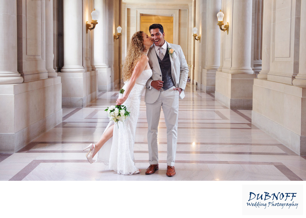
We had a wonderful time with this bride and groom at San Francisco city hall. They asked us to have their city hall wedding photography show lots of the building's architecture and we were more than happy to oblige. We feel that our specialty at San Francisco City Hall is displaying the amazing Beau Arts inspired architecture while still highlighting the couple. One of the traits of this type of architecture is the repeating lines and symmetrical patterns. As you can see in the image above, even the hallway displays this characteristic.
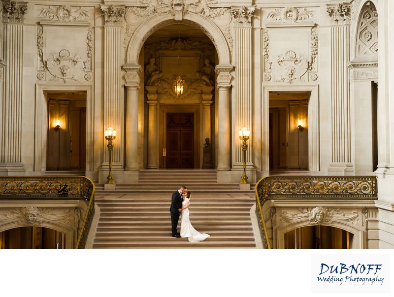
We placed our Bride and Groom just slightly off center in the hallway and the bride did the rest with this cute kiss. Interactive posing is always better than static shots. We want our couple to move and have fun with each other. These are the types of memories they want for their wedding album. Even though there is a place for formal wedding images, nobody wants a stiff pose. In the photo below, the couple appears quite small, but we always included plenty of close ups such as the main photo above. The amazing architecture at San Francisco city hall demands that we provide our newlyweds with a little of both. To see more city hall wedding photos click the highlighted link.

Above is another example city hall's fantastic architecture. Note how balanced everything is. It is great such a great place for wedding photography! Being a wedding photographer at San Francisco City Hall can be a quite different type of place to pose your couples. This is mainly because of the architecture. In standard portrait photography you try not to always put the couple in the center of the photo. In some cases it is appropriate, but often we try to use the rule of thirds and place the couple off-center maybe one third of the way over from the edge of the frame. While we still do this at City Hall, we also create quite a few photos like the one above where we center the couple and try to also key in on the architecture. To avoid distortion, centering the photos is usually necessary. Otherwise the repeating lines and parallel architecture of City Hall looks out of place. In some cased they might even appear diagonal which of course can minimize the impact of the symmetrical architecture. One of the hallmarks of Beaux Arts architecture is the even patterns caused by repeating lines. We strive to include photos that show this beauty, but also focus on the couple. If you read some of our San Francisco City Hall photography reviews that we receive you will see that many people really appreciate our focus on architecture.
Other Photography Options: